May 2 to May 7: B.A. and B.S, Students
May 9 to May 16, B.F.A. Seniors.
Amelie A. Wallace Gallery at SUNY Old Westbury
These works vary from comics to oil paintings to collages to digital art. These pieces showcase the diversity and technical acumen of the art students on campus. While every piece had its own positives and negatives, it would take too much time to cover every single student’s work, so this article will only discuss the most notable.
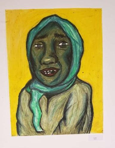
Emily Riggle’s Lauretta
Accompanying the pieces were artist statements, written by the students, explaining the purpose of their works. Some students had a collection of works, while others only had one major work – however these were pieces that seemed to have taken an extensive amount of time.
The B.A./B.S. students whose work was shown are Justina Brennan, Emily Colwell, Marcus Etienne, Aryanna Griffin, Salvatore Guarneri, Milo Paris, Emily Riggle, Vanesa Soto, Bobby Thomas, and Matthew Yarde. The B.F.A. students are John Dell’Olio, Jake Mascolo, Melissa Mery, and Karla Panameno.
On the first floor, immediately upon walking in, one could see the homeless portraits by Emily Riggle. These colorful portraits use oil pastels and depict homeless people not with abject realism, but a maximalist subjectivity that reveals the truth of what’s on display. The portraits have the same structure; the subject and the background are complementary colors.
The standout work, the portrait Lauretta, shows the smiling subject colored a sickly green, while the background is a nauseating yellow. The use of these colors and the composition highlight how being homeless can feel terrible, all while the subject’s uneasy smile hints at a sometimes kinder reality. The other works have a similar effect and show the different kinds of people that find themselves homeless, from young kids to old women.
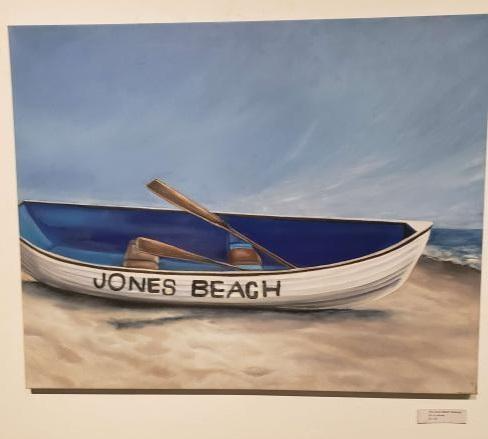
Justina Brennan’s The Jones Beach Rowboat
On the main floor, on the right side, were the more traditional oil paintings of Justina Brennan. In the age of photography, it might seem redundant to paint realistic images, but Brennan’s paintings of famous Long Island places appeal to two of my favorite things: sentimentality and simple, effective structure.
In the artist’s statement, Brennan says that these works are all places that hold a special place in her heart. A key place in these works is Jones Beach, as the water tower and other signature attractions (a rowboat and the boardwalk) are subjects. The painting of the Jones Beach rowboat has such a depth to it and drives home the notion that Brennan is someone technically skilled. The rowboat is the subject but she does not neglect the beauty of the shoreline sky.
On the lower level, the collage works of Emily Colwell were displayed. Using photographs from her actual life, Colwell tells sweet, nostalgic stories. The colors evoke this sweetness, as the baby blues and pinks wouldn’t be out of place on a cupcake. Themes about things coming together through time permeate these works.
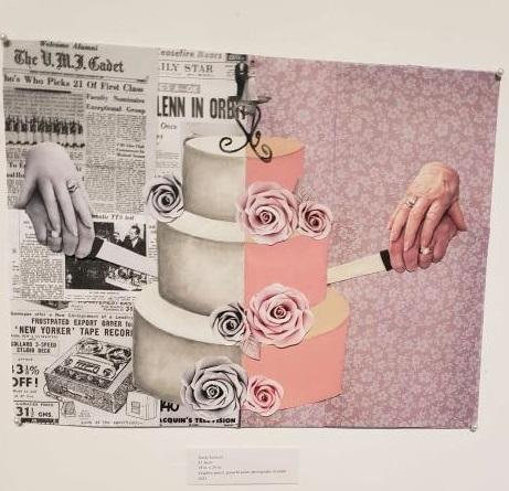
Emily Colwell’s 61 Years
In 61 Years, we can see hands (one old, one young) cutting through a wedding cake. The black and white newspaper on one side, with color on the other, shows the temporal divide closing and meeting in this one simple gesture – the cutting of a cake.
On the same floor were the digital media pieces of Vanesa Soto. These works are all connected as they express the environmental crises that plague the Amazon rainforest. This collection contains works that are more traditional, that try to act as photographs. However, the pieces that stuck with me were the more abstract creations.
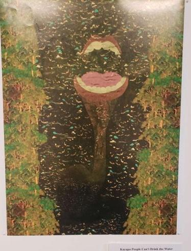
Vanesa Soto’s Kayapo People Can’t Drink the Water
For instance, I found the surreal visuals in, Kayapo People Can’t Drink the Water, to be worth much more than the more grounded works, like Inca Protest which shows exactly that – a protest. In the former work, the abstract visuals allow the piece to tell a more powerful story than conventional imagery ever could. The black river flows while a disembodied mouth howls; this is an imaginative and haunting metaphor for the butchery that continues in the Amazon.
Melissa Mery’s Untitled
Moving on to the B.F.A. seniors’ pieces, we can see the graduating students showing a terrific grasp on their respective forms. For the sake of brevity, I can only discuss two of the artists at length, but I will give a brief summary of the other two artists’ work.
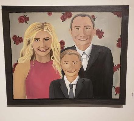
Melissa Mery’s cynical suburban oil paintings depict the dour reality in their color palette and imagery. Jake Moscoso’s 3D sci-fi animation left much to be desired from an artistic standpoint, but I felt it was worth mentioning as it showed someone honing their skill in the animation program, Blender. The creature designs were fun.
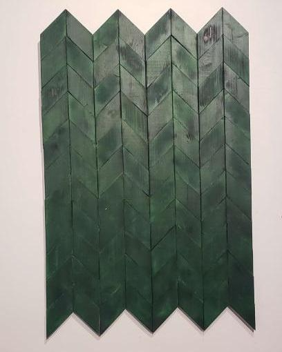
John Dell’Olio’s wood sculptures were, to my surprise, some of the most inspired works of the whole event. The textures had such a tone to them; it’s the little crevices and darker coloring that makes these works interesting. Some were even painted.
John Dell’Olio’s Untitled 3
According to the artist’s statement, an important aspect of the collection was the focus on sustainability. This theme struck me not just because I’m a longhaired freak, but also because it is important to remember that art can be intensely expensive and un-sustainable. One work, Untitled 3, is made up entirely of an old bed frame.
Dell’Olio elaborated on how he created the textures saying, “I used a torch to create a darker pattern,” and how the wood was “sandpapered to bring out the color.” This is what gives these works their distinctive look.
Karla Panameno’s Escaping Reality
For this collection, Dell’Olio was looking to break the mold from his previous works: “In the past, I manipulated material, now the material manipulated me.” He also goes on to say that he lacked concept before, and with this work, I fully believe he achieved a uniform concept; why spend money on exotic paint when the best stuff is around you.
This same sentiment can be found in Karla Panameno’s collages. These works are focused on showing everyday life, similar to Mery’s paintings, but both are expressed in polar opposite ways.
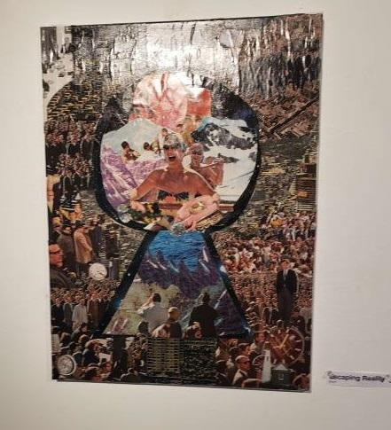
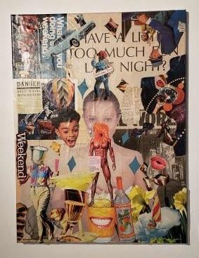
Using images from magazines and newspapers, Panameno creates an expressive explosion of collages. One of the best works, Escaping Reality, shows a swarm of business suit-clad people surrounding photos taken from travel magazines, the Alps, the ocean, etc. Works like this and, Have A Little Too Much Last Night?, show the intoxicating, numbing lure of modern existence. “You can start at it for hours and find something new.” said John Dell’Olio, when asked what he thought of the works.
Karla Panemeno’s Have A Little Too Much Last Night?
Collages have quickly become one of my favorite mediums. Like Dell’Olio’s wood sculptures, collages make something from waste. That’s how you know an artist is really something, they make the mundane exceptional and memorable.
Anyone can do a high concept film or whatever, but to take leftover wood or cut-and-paste images and make that memorable – make that something – that takes true artistry.
When asked how Panemo chooses what she uses, she says she only uses images from pre-1990s magazines. “I love vintage and retro magazines,” she explained. “Nothing was crisp, no one was perfect.” The yearning for imperfection, in a world that lauds perfection like Jesus on a donkey, is at the very core of these works.
Panameno and Dell’Olio are two sides of the same coin; they recycle to create art, but Dell’Olio manifests something more down to Earth, while what Panameno creates is more ornate and extravagant.
All this goes to show that there is genuine talent at Old Westbury and I look forward to seeing what next semester’s art students can come up with, as they have big shoes to fill.


